Diberdayakan oleh Blogger.

Project Review: Indiana Jones and the Kingdom of the Lost Skull[ IV] PART II: DC-3

 The DC-3 I built for some Motion Graphics pitches done at The Cimarron Group in 2008.


 A side shot showing the modeled panels, rivets, metal warps, and gaps[ no texture mapped fakes]


  A shot showing the engine pod detailing on the DC-3 from Indy 4.


 A Grey scale render showing the surfaces smoothed near the nose.


  A Grey scale render showing the underside of the plane, seen in bank shots.


  A Grey scale overhead render of the plane I made for Indiana Jones 4.


  A Grey scale render Showing the wing details with a back-light catching metal buckling on the wing skin etc.
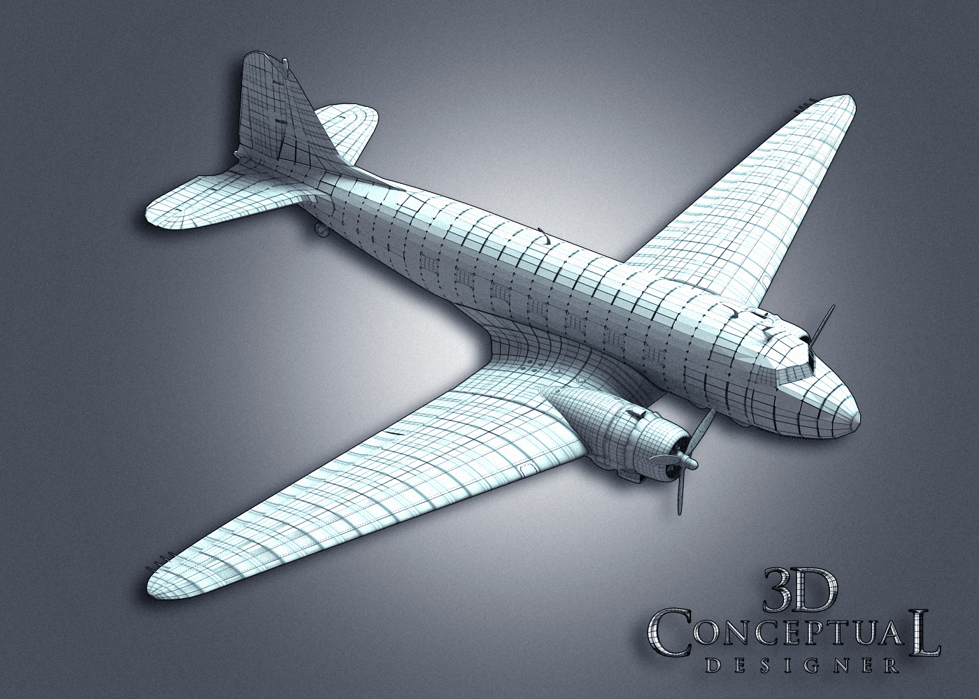


 A Quad view of the model with sub-division OFF.


 Indian Jones and Kingdom of the Crystal Skull
PART II: DC-3 Model


Client: Paramount Pictures
Art Director[s]: Calvin Sumler, Joseph Stamper, and Chris A. Hawkins
Date: Spring 2007


This is second post for Indiana Jones four, The Kingdom of the Lost Skull, showing the work I did for the advertising key art, and especially for Motion Graphics work.

Today, we look closer to the DC-3 plane I built for trailers we pitched for Indy. We went with the red line animated on a map look from the films interstitials, but updated it to the plane POV done in full 3D. The animator Ehren Addis, a pilot himself, rigged and finished the work out for them.

The MGFX team bought a model online but it lacked the details, and the level of finish needed to sell the idea, so I was tasked at re-doing the entire outer skin of the plane. 

You can view PART I here.


Cheers, THOM
read more "Project Review: Indiana Jones and the Kingdom of the Lost Skull[ IV] PART II: DC-3"

3D Conceptual designer posts pass the 3000 mark.


3D Conceptual Designer Passes 3000 mark for Portfolio Images

I started this blog to create an online record of my Entertainment Design work and to provide a resouce for aspiring artists to review actual production work in the conceptual design fields of, theme park, theatrical advertising, product design, and general entertainment design.

Late last week I passed the 3000 mark for images that I have posted here on my design blog since I began in October of 2009. You can search this blog easily via the Google toolbar, up top on the left,[white box] using standard keywords, or you can search via the tags on the right based on topics like, 3D-Logos, or sketches etc.

I plan to fully archive my work online here over the years with 2D, and 3D related design posts, along with stories of interest, tips and techniques via tutorials as well. I have about 1/3 of my work up so far.


Cheers, THOM
read more "3D Conceptual designer posts pass the 3000 mark."

Project Review: Blood and Chocolate : Motion Graphics Style Frames 2006


 Verdigre aged Brass Type over concrete for this style frame for Blood and Chocolate.


 A Procedural layered Concrete with cross hatched lower layers with a dirt shader on this look.


 A brighter Golden look over Purple material[ satin-ish]


 This was fun in motion, as the background is a cracked glass in red so it is reflecting the type and skewing the reflections to create the shattered red effects behind the test, and when I moved the light it really read as a thickness.


 We had one tag line I modeled in 3D and animated as well, here was what we sent over.


An alternate early look with a blocked font over a cave wall [ prior to going back to Trajen]


Inside a Gothic cathedral I developed this look where the type did a slow drift forward.


Project Review
Blood and Chocolate
Motion Graphics Style Frames 2006

Client: Metro-Goldwyn-Mayer[ M.G.M.] via The Cimarron Group.
Art Director: n/a.
Project Date:Fall 2006

After 6 years running a 3D department of one, at The Cimarron Group, I got the chance to work on over one hundred film Theatrical Trailers, with 80+ finishes, so it was a regular occurrence to create what are called "Style Frames".

These illustrate the intended look for the moving type, to be used to sell the looks for buy off before the labor to move it around is approved by the internal client first. I was asked to develop a few looks and so I did.

Though none of these were used in the finals, they all were shown. And as always I built the type as a Single Pointed Bevel with the Trajan font[ used every week in Advert's] and did a series of looks using the procedural textures I build in Dark Tree.

Cheers, THOM
read more "Project Review: Blood and Chocolate : Motion Graphics Style Frames 2006"

blue


read more "blue"

german


read more "german"

Project Review:DVD Menu Design for The Cimarron Group Home Entertainment Reel 2008

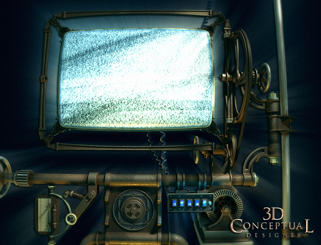
 The first concept 3D design I did was this large single monitor CRT design, here it is rendered in ambient material with a dirt pass to exaggerate the cracks and design elements.

 Here is the textured color pass on the above first draft scene. A bunch of the 3D models they sell on TurboSquid are found in here[ Mic,Generator, etc.]

Here I clumped a bunch of various monitors together that would animate to create this menu. All types of video screens are found here.

Here is the above scene with a few monitors removed for the Blue RAY Menu.


 The final design, though not used was rendered at a full 1080p HD size for the final menus and intro aniamtions.


Project Review
DVD Menu Design for The Cimarron Group
Home Entertainment Division Reel 2008

Client: The Home Entertainment Division of The Cimarron Group.
Creative and Art Direction: George Anderson, and Brian Larson.
Project Date: June 2007- March 2008

While in-house as a 'One Man Army', running my little 3D department, I did a few projects for them, so they tasked me with the DVD Menus for the yearly reels we would send out to solicit business, and to highlight the accomplishments of the various teams.

I had in the past done quite a few DVD menu assets, animated and stills, for the Home Entertainment department, and an occasional 3D logo, so they had me design out theis menu screen with a Stempunk flair to it with a set of animated video monitors, and old TV's that would show off the companys work.

The project dragged out over they next year, and the assets as far as I know were never used, but as all design work is subject to the cutting room floor, that in no way discounts the great learning curve, and quite frankly the FUN I have doing the work.

I love steampunk, I did a lot of Jules Verne inspired designs since I was a kid as I grew up with Disney s 20,000 leagues Under the Sea, and that was the hot item growing up in the 70's for what is now called, "steampunk". Old TV's and all the hardware is fun to assemble along with the cast iron Victorian era-eaque' frames and wheels.

I learned early on, NOT to care if it finishes, enjoy the process the creation you made, as I know that the decision process in almost NEVER based on a good idea or art execution, but the temperment of the cilent that particular hour of the day, or even minute by minute[ just wait a minute they will change their mind again!].

Advertising is all about the clients EGO's, so for the young designers with wild eyes out there it is a wake up call, as to what they say in Design School, and as with all of life, some can deal with this sad truth, and some not.


Cheers, THOM
read more "Project Review:DVD Menu Design for The Cimarron Group Home Entertainment Reel 2008"

+

powered by Citroen...:)
read more "+"
Copyright © interiorhome. All Rights Reserved.
Blogger Template designed by Big Homes.